Evaluating Readability-Score.com
First, The Site
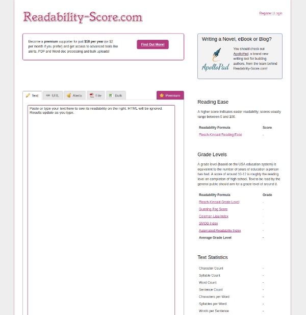
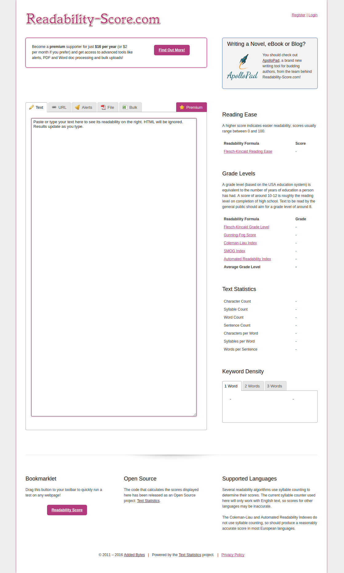
The current site will be replaced soon (very soon) with a new shiny version, so for posterity, here's the current look (click for full-size horror):
I'm in the late stages of the rebuild of the site - I made the decision to update it back in March, when I started evaluating my web portfolio in earnest and made the decision to launch GetPostCookie. It was clear to me from the traffic on Readability-Score.com and the conversion rate that it had the potential to perform better financially, so I spent some time looking at it a bit more critically. This was the result.
The Good
I think maybe the most positive thing about the current version of the site is that it wasn't very time-consuming to create. Readability-Score.com started as a bit of fun on my own site, and as usage grew it was migrated to its own domain, and expanded as usage continued to grow. Eventually, premium membership and some extra features were tacked on, but all along the way it has been a piecemeal, reactive approach. And in that respect, it's been very obliging - it's not taken much time to create the current look.
What I do like is that the focus is on the text. There is no ambiguity about what the site does - it measures the readability of text. It's basic and functional and has little in the way of frills. The design gets out of the way of your work. All that's nice, and I'd like to keep that in the new version.
I also quite like that it's visually quite distinct from the rest of my sites. No tepid blues or greens here, just bright pink. It might be a bit much in places, but it's nice to work on a site with a different palette for a change.
The Bad
The site is confused. The action I want people to take - signing up and paying to use the site - is pretty much lost. It's a polite request that's easy to ignore, not tempting or even eye-catching. If you do click on the "Premium" tab, it's confusing. The benefits of the premium offering aren't clear. From a purely sales perspective, it sucks.
Unfortunately, the problems don't stop there. The readability scoring section is confusing and disorganised, thrown together in a haphazard way. It shouldn't even be visible on the file and bulk processing pages - it doesn't do anything there!
The site is also far too generous. The main text scoring tool is entirely free and unlimited. The URL scoring is entirely free and unlimited. While both of these are lovely tools to be able to offer for free, there are people using these dozens of times a day without contributing towards the costs of running the thing. Readability-Score.com shares its hosting with some of my other sites, but it takes the lion's share of the processing on its server and the URL processing especially is a big part of that.
User passwords are generated automatically and emailed, but the emails don't always make it, and people like to be able to set their own passwords. This has been an incredibly frustrating part of the system for the existing users, and it needs fixing.
Finally, the site advertises a completely different site. While I do expect that ApolloPad will be the focus of my attentions for most of the rest of this year, it has no place being advertised here. I need this site to focus inwards, to do what it does well, and to give people plenty of reason to try the premium service.
The Ugly
Oh man, that logo. It needs to go. It's fine for a tiny hobby site with no ambition, but it's not nice to look at, it's not evocative in any way, and it doesn't even scale well. This might be the thing I'm least happy with in the current look.
The rest of the site is a bit boxy. The right-hand side includes the scoring information for the current page, but that doesn't make any sense on pages without live scoring, like the file processing or alerts pages. The footer is messy. The text is too small. In fact, list every element of design on the current site, remove the items I've listed above, and you have a list of the things I'm not happy with.
What Next?
I had been thinking about upgrading Readability-Score.com for a few months, and had already started the logo redesign process and a rethinking of the look. However, I have a few more changes to add to my plan before I launch the new version.
First, I have to change the free offering. I really want to keep it free for occasional users, but need to ensure that the high-frequency users are paying for the service. So, I'm going to add some daily limits to the text and URL processing tools. Hopefully that doesn't scare away the user base. From the stats, it looks like this will only affect a few users. I'm also going to give more free usage to logged-in but non-premium users, to encourage even the infrequent users to register on the site. Once they are registered, I can show them a little more of what the premium service offers, and maybe a few more will decide it's useful to them.
Next up, proper account management. The ability to change email addresses and passwords is something the site has needed for a long time, so it's top of my list. Password queries are probably my biggest support cost on the site, so it'll be great to modernise this!
I'm going to keep the colour scheme, but rethink the entire layout. Tools will be the highest priority, and I'll be adding a nice clear call to action to push people to the premium page. That will, in turn, be much clearer about what's on offer. When people hit the daily limits on the URL and text tools, I'll add a little popup with a brief version of this page to show them what Premium is, and what it offers.
I'm going to add a "Business" level of subscription, with access to a new API. There have been a few requests for a readability API over the years, so it's time I gave those people what they asked for!
Finally, I'm going to swap the awesome Gumroad for something a bit more suited to subscription processing, and take the card details on-site. It's jarring being sent to another site to pay, and it's lost more than a few sales. It's a shame, as I like Gumroad, but I'm going to switch to Stripe for payments on the new version of the site.

Dave Child
Fanatical entrepreneur, PHP developer, maker of cheat sheets and all-round internet enthusiast.
Built by Dave: Readable, Cheatography and ApolloPad.
Latest Posts
- Wordle Alternatives - A Comprehensive List (276 and counting)
- Raganam - A Daily Anagram Game
- The MP Shop
- The Pain Of Technical Debt
- The Last Move: Readable.com